Please be aware that this page contains both Python and R code, thus you should avoid running the source code all at once.
Brief Introduction to EDA
Exploratory Data Analysis (EDA) is a fundamental starting point in data analysis, helping us grasp the data’s characteristics, patterns, and possible outliers. It provides essential insights for making informed modeling decisions.
By analyzing the below data, I hope to gain an understanding of overall trends that can aid in refining my hypothesis and inform the construction of a more accurate model.
ncaahoopR
2021-22 season
Code
# let's read in the data and load in relevant librariesnova2122 <- read.csv('./data/modified_data/nova2122.csv')library(tidyverse)
-- Attaching core tidyverse packages ------------------------ tidyverse 2.0.0 --
v dplyr     1.1.2     v readr     2.1.4
v forcats   1.0.0     v stringr   1.5.0
v ggplot2   3.4.2     v tibble    3.2.1
v lubridate 1.9.2     v tidyr     1.3.0
v purrr     1.0.1
-- Conflicts ------------------------------------------ tidyverse_conflicts() --
x dplyr::filter() masks stats::filter()
x dplyr::lag()    masks stats::lag()
i Use the conflicted package (<http://conflicted.r-lib.org/>) to force all conflicts to become errors
Code
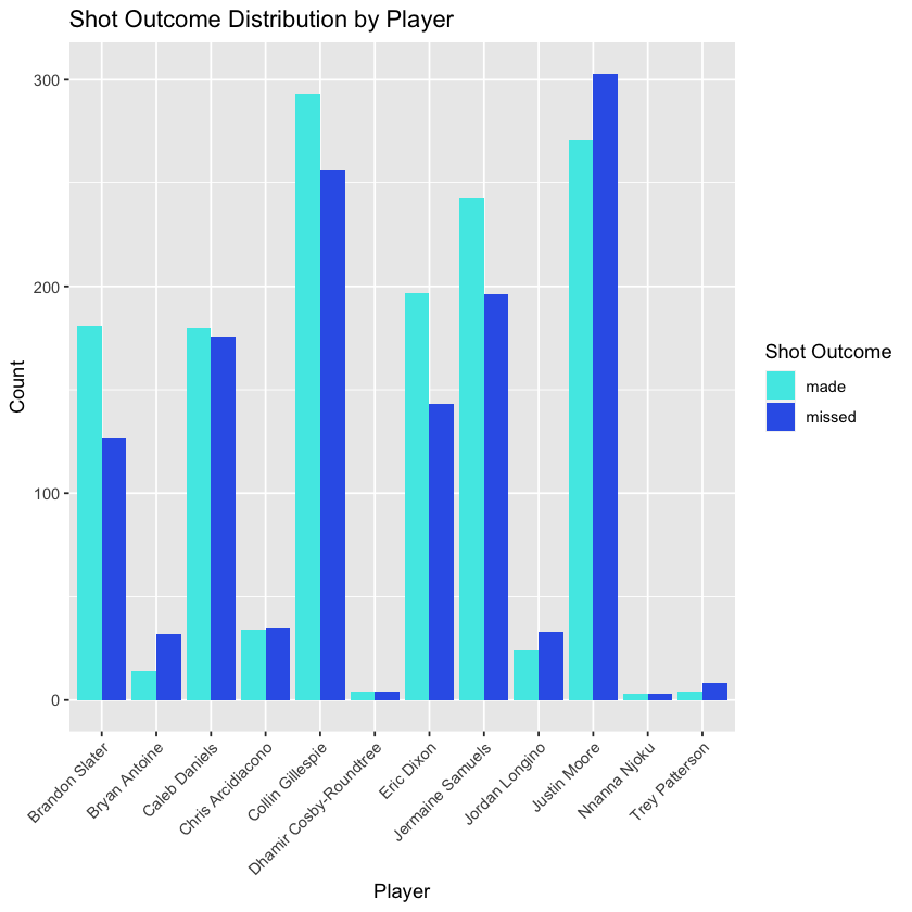
# Create a ggplot for shot outcome distribution by villanova playersnova_players <- nova2122 %>%filter(shooter_team =="Villanova")ggplot(nova_players, aes(x = shooter, fill = shot_outcome)) + geom_bar(position ="dodge") + labs(title ="Shot Outcome Distribution by Player", x ="Player", y ="Count") + theme(axis.text.x = element_text(angle =45, hjust =1)) + scale_fill_manual(values = c("missed"="#3464e9", "made"="#4de9e6")) + guides(fill = guide_legend(title ="Shot Outcome"))# Calculate the mean of shot_outcome for each player (aka field goal percentage)mean_and_count_data <- nova_players %>% group_by(shooter) %>% summarize( shots = n(), field_goal_percentage = mean(ifelse(shot_outcome_numeric ==-1, 0, shot_outcome_numeric), na.rm = TRUE) ) %>% arrange(-shots) mean_and_count_data
A tibble: 12 x 3
shooter
shots
field_goal_percentage
<chr>
<int>
<dbl>
Justin Moore
574
0.4721254
Collin Gillespie
549
0.5336976
Jermaine Samuels
439
0.5535308
Caleb Daniels
356
0.5056180
Eric Dixon
340
0.5794118
Brandon Slater
308
0.5876623
Chris Arcidiacono
69
0.4927536
Jordan Longino
57
0.4210526
Bryan Antoine
46
0.3043478
Trey Patterson
12
0.3333333
Dhamir Cosby-Roundtree
8
0.5000000
Nnanna Njoku
6
0.5000000
The table displayed above, arranged in descending order based on the number of shots attempted, presents the field goal percentages of Villanova Men’s Basketball (MBB) players for the 2021-22 season. The accompanying ggplot-generated graph visually represents the count of both missed and successful shots for each player. This visualization emphasizes the significant variation in the number of shots taken by different players, which could offer richer data and potential insights for subsequent modeling.
Code
# Create lag variables within each shooter and game_id groupnova2122 <- nova2122 %>% arrange(shooter, game_id, play_id) %>%# Arrange the data by shooter, game_id, and play_id group_by(shooter, game_id) %>% mutate( lag1 = lag(shot_outcome_numeric, order_by = play_id), lag2 = lag(shot_outcome_numeric, order_by = play_id, n =2), lag3 = lag(shot_outcome_numeric, order_by = play_id, n =3), lag4 = lag(shot_outcome_numeric, order_by = play_id, n =4), lag5 = lag(shot_outcome_numeric, order_by = play_id, n =5), lag6 = lag(shot_outcome_numeric, order_by = play_id, n =6)) %>% ungroup() %>% arrange(game_id, play_id)write.csv(nova2122, file="./data/modified_data/nova2122_updated.csv", row.names = FALSE)# View the updated data with lag variableshead(nova2122)
A tibble: 6 x 15
game_id
play_id
half
shooter
shot_outcome
shooter_team
shot_outcome_numeric
shot_sequence
previous_shots
lag1
lag2
lag3
lag4
lag5
lag6
<int>
<int>
<int>
<chr>
<chr>
<chr>
<int>
<int>
<int>
<int>
<int>
<int>
<int>
<int>
<int>
401365747
4
1
Justin Moore
missed
Villanova
-1
-1
0
NA
NA
NA
NA
NA
NA
401365747
7
1
Clifton Moore
missed
La Salle
-1
-1
0
NA
NA
NA
NA
NA
NA
401365747
11
1
Clifton Moore
missed
La Salle
-1
-2
-1
-1
NA
NA
NA
NA
NA
401365747
13
1
Eric Dixon
missed
Villanova
-1
-1
0
NA
NA
NA
NA
NA
NA
401365747
16
1
Collin Gillespie
made
Villanova
1
1
0
NA
NA
NA
NA
NA
NA
401365747
18
1
Eric Dixon
made
Villanova
1
1
-1
-1
NA
NA
NA
NA
NA
Code
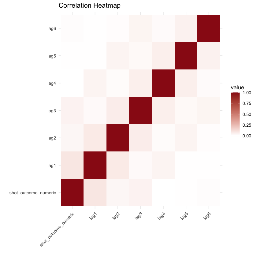
# Calculate the correlation matrixcor_matrix <- cor(nova2122[, c("shot_outcome_numeric", "lag1", "lag2", "lag3", "lag4", "lag5", "lag6")], use ="pairwise.complete.obs")library(reshape2)cor_data <- melt(cor_matrix)ggplot(cor_data, aes(Var1, Var2, fill = value)) + geom_tile() + scale_fill_gradient2(low ="#f69696", high ="#9a1717", midpoint =0) + labs(title ="Correlation Heatmap", x ="", y ="") + theme_minimal() + theme(axis.text.x = element_text(angle =45, hjust =1))
The correlation heatmap presented above carries an intriguing insight. Although it may not reveal strong correlations between “shot_outcome_numeric” and the lag variables individually, a notable descending trend emerges from “lag1” to “lag6.” This observation could provide valuable insight, suggesting that a player’s shot outcome is more likely to be influenced by their immediate prior shot, rather than a shot taken several attempts ago.
2019-20 season
To assess potential disparities, let’s replicate the same analysis for the 2019-20 season and compare the resulting graphs and tables with those generated earlier. This comparative approach will help us identify any noticeable differences and potential insights.
Code
#let's read in the datanova1920 <- read.csv('./data/modified_data/nova1920.csv')
Code
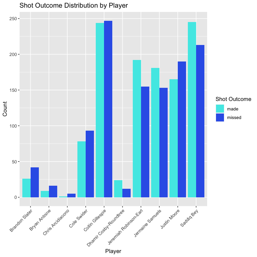
# Create a ggplot for shot outcome distribution by villanova playersnova_players <- nova1920 %>%filter(shooter_team =="Villanova")ggplot(nova_players, aes(x = shooter, fill = shot_outcome)) + geom_bar(position ="dodge") + labs(title ="Shot Outcome Distribution by Player", x ="Player", y ="Count") + theme(axis.text.x = element_text(angle =45, hjust =1)) + scale_fill_manual(values = c("missed"="#3464e9", "made"="#4de9e6")) + guides(fill = guide_legend(title ="Shot Outcome"))# Calculate the mean of shot_outcome for each playermean_and_count_data <- nova_players %>% group_by(shooter) %>% summarize( shots = n(), field_goal_percentage = mean(ifelse(shot_outcome_numeric ==-1, 0, shot_outcome_numeric), na.rm = TRUE) ) %>% arrange(-shots) mean_and_count_data
A tibble: 10 x 3
shooter
shots
field_goal_percentage
<chr>
<int>
<dbl>
Collin Gillespie
491
0.4969450
Saddiq Bey
458
0.5349345
Justin Moore
355
0.4647887
Jeremiah Robinson-Earl
347
0.5533141
Jermaine Samuels
334
0.5419162
Cole Swider
171
0.4561404
Brandon Slater
68
0.3823529
Dhamir Cosby-Roundtree
36
0.6666667
Bryan Antoine
25
0.3600000
Chris Arcidiacono
6
0.1666667
Code
# Create lag variables within each shooter and game_id groupnova1920 <- nova1920 %>% arrange(shooter, game_id, play_id) %>%# Arrange the data by shooter, game_id, and play_id group_by(shooter, game_id) %>% mutate( lag1 = lag(shot_outcome_numeric, order_by = play_id), lag2 = lag(shot_outcome_numeric, order_by = play_id, n =2), lag3 = lag(shot_outcome_numeric, order_by = play_id, n =3), lag4 = lag(shot_outcome_numeric, order_by = play_id, n =4), lag5 = lag(shot_outcome_numeric, order_by = play_id, n =5), lag6 = lag(shot_outcome_numeric, order_by = play_id, n =6)) %>% ungroup() %>% arrange(game_id, play_id)# View the updated data with lag variableshead(nova1920)
A tibble: 6 x 15
game_id
play_id
half
shooter
shot_outcome
shooter_team
shot_outcome_numeric
shot_sequence
previous_shots
lag1
lag2
lag3
lag4
lag5
lag6
<int>
<int>
<int>
<chr>
<chr>
<chr>
<int>
<int>
<int>
<int>
<int>
<int>
<int>
<int>
<int>
401166061
2
1
Duane Washington Jr.
made
Ohio State
1
1
0
NA
NA
NA
NA
NA
NA
401166061
4
1
Saddiq Bey
missed
Villanova
-1
-1
0
NA
NA
NA
NA
NA
NA
401166061
6
1
Saddiq Bey
missed
Villanova
-1
-2
-1
-1
NA
NA
NA
NA
NA
401166061
8
1
Duane Washington Jr.
made
Ohio State
1
2
1
1
NA
NA
NA
NA
NA
401166061
9
1
Collin Gillespie
missed
Villanova
-1
-1
0
NA
NA
NA
NA
NA
NA
401166061
11
1
CJ Walker
made
Ohio State
1
1
0
NA
NA
NA
NA
NA
NA
Code
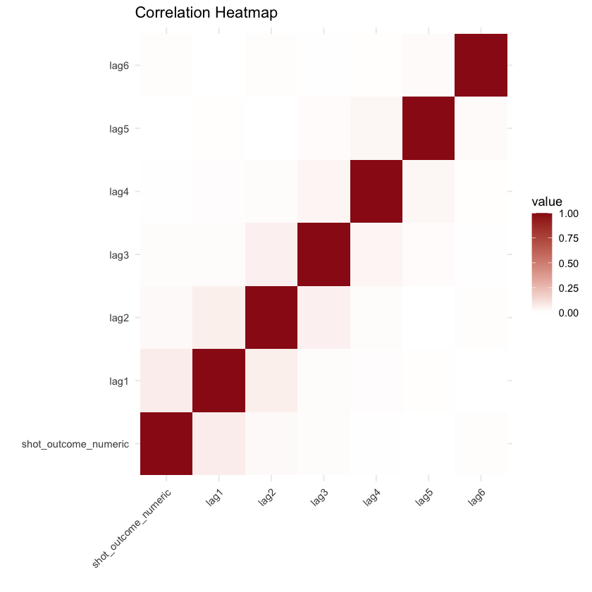
# Calculate the correlation matrixcor_matrix <- cor(nova1920[, c("shot_outcome_numeric", "lag1", "lag2", "lag3", "lag4", "lag5", "lag6")], use ="pairwise.complete.obs")library(reshape2)cor_data <- melt(cor_matrix)ggplot(cor_data, aes(Var1, Var2, fill = value)) + geom_tile() + scale_fill_gradient2(low ="#f69696", high ="#9a1717", midpoint =0) + labs(title ="Correlation Heatmap", x ="", y ="") + theme_minimal() + theme(axis.text.x = element_text(angle =45, hjust =1))
Attaching package: 'reshape2'


The following object is masked from 'package:tidyr':

    smiths
We can observe that, despite some player variations, most of the graphs maintain a substantial degree of consistency, which further supports the earlier findings.
News API
Code
#import necessary librariesimport pandas as pdimport numpy as npimport seaborn as snsimport matplotlib.pyplot as pltnews_api = pd.read_csv('./data/modified_data/sentiment_scores_with_titles.csv')
Code
#what does this data look like?news_api.head()
Title
Description
Sentiment Label
0
how to watch jack catterall vs jorge linares l...
jack catterall hopes to add a win to his resum...
positive
1
jaguars vs steelers livestream: how to watch n...
jacksonville look to make it five wins in a ro...
positive
2
vikings vs packers livestream: how to watch nf...
want to watch the minnesota vikings play the g...
positive
3
dolphins' chase claypool says there was 'frust...
after being traded from the 1-4 chicago bears ...
negative
4
seahawks vs bengals livestream: how to watch n...
two of the nfl's most potent offenses clash in...
negative
Code
import nltknltk.download('stopwords')nltk.download('wordnet')nltk.download('omw-1.4')import refrom nltk.corpus import stopwordsfrom nltk.stem import WordNetLemmatizer# Initialize the Lemmatizer and stopwords listlemmatizer = WordNetLemmatizer()stop_words =set(stopwords.words('english'))def preprocess_text(text):# Remove special characters and numbers text = re.sub(r'[^a-zA-Z]', ' ', text)# Tokenization and lowercase words = text.lower().split()# Remove stopwords and apply lemmatization words = [lemmatizer.lemmatize(word) for word in words if word notin stop_words]return' '.join(words)# Apply preprocessing to the 'text' columnnews_api['cleaned_text'] = news_api['Description'].apply(preprocess_text)
[nltk_data] Downloading package stopwords to
[nltk_data]     /Users/williammcgloin/nltk_data...
[nltk_data]   Package stopwords is already up-to-date!
[nltk_data] Downloading package wordnet to
[nltk_data]     /Users/williammcgloin/nltk_data...
[nltk_data]   Package wordnet is already up-to-date!
[nltk_data] Downloading package omw-1.4 to
[nltk_data]     /Users/williammcgloin/nltk_data...
[nltk_data]   Package omw-1.4 is already up-to-date!
Code
news_api.to_csv('./data/modified_data/news_api_naive.csv', index=False)#what does the new column of data look like?news_api.head()
Title
Description
Sentiment Label
cleaned_text
0
how to watch jack catterall vs jorge linares l...
jack catterall hopes to add a win to his resum...
positive
jack catterall hope add win resume redeem loss...
1
jaguars vs steelers livestream: how to watch n...
jacksonville look to make it five wins in a ro...
positive
jacksonville look make five win row head pitts...
2
vikings vs packers livestream: how to watch nf...
want to watch the minnesota vikings play the g...
positive
want watch minnesota viking play green bay pac...
3
dolphins' chase claypool says there was 'frust...
after being traded from the 1-4 chicago bears ...
negative
traded chicago bear miami dolphin last friday ...
4
seahawks vs bengals livestream: how to watch n...
two of the nfl's most potent offenses clash in...
negative
two nfl potent offense clash cincinnati
Code
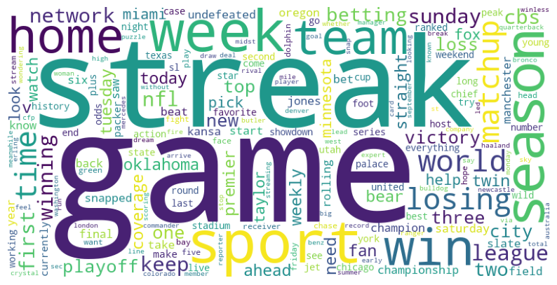
# Import more necessary librariesfrom wordcloud import WordCloud, STOPWORDSimport matplotlib.pyplot as plt# Define the function to plot the word clouddef plot_cloud(wordcloud):# Set figure size plt.figure(figsize=(10, 6))# Display the word cloud plt.imshow(wordcloud)# Remove axis details plt.axis("off")# Show the word cloud plt.show()# Define the function to generate and display the word clouddef generate_word_cloud(my_text):# Generate the word cloud wordcloud = WordCloud( width=800, height=400, background_color='white', colormap='viridis', collocations=False, stopwords=STOPWORDS ).generate(my_text)# Plot and display the word cloud plot_cloud(wordcloud)# let's pass the 'cleaned_text' column to the functiongenerate_word_cloud(' '.join(news_api['cleaned_text']))
Within the word cloud, generated from articles collected through the news API, notable recurring terms include “win,” “losing,” “victory,” “winning,” “matchup,” and others. These terms hold the potential to offer insights into the articles’ context and serve as valuable cues for conducting sentiment analysis.
Individual Player Data
Code
#let's import some libraries import pandas as pdimport numpy as npimport seaborn as snsimport matplotlib.pyplot as plt
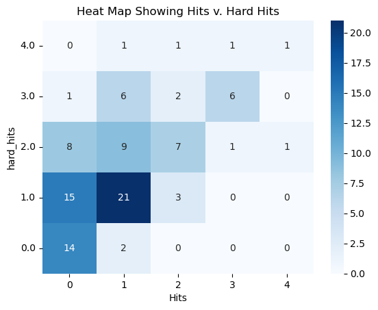
# Create a pivot table to count the observationspivot_table = aaronjudge.pivot_table(index='hard_hits', columns='H', aggfunc='size', fill_value=0)# Create a heatmapax = sns.heatmap(pivot_table, cmap="Blues", annot=True, fmt="d")# Customize the y-axis to start at 0 and increase as you go upax.set_yticklabels(ax.get_yticklabels(), rotation=0)ax.invert_yaxis()# Customize the plot if neededplt.title("Heat Map Showing Hits v. Hard Hits")plt.xlabel("Hits")plt.ylabel("hard_hits")plt.show()
In this heatmap, hits are represented on the x-axis, while hard hits are depicted on the y-axis. The unit of observation corresponds to a player’s at-bats within a game. Notably, there are instances, such as nine games for the specific player Aaron Judge, where he had two hard-hit balls but only managed to secure one hit. While the seaborn-generated graph above indeed suggests a positive correlation between these variables, there are discernible distinctions between them. It prompts the consideration that using hard hit percentage as a target variable to measure success may offer a more robust approach, as it mitigates factors beyond the batter’s control. For example, a batter might make solid contact (barrel the ball) but hit it directly to a fielder, categorizing it as a hard hit ball without resulting in a hit. Hence, hard hit percentage emerges as a more suitable target variable for assessment.
Code
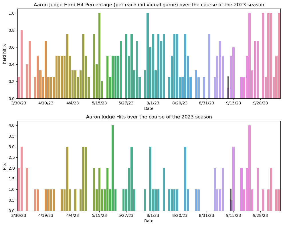
# Sort the DataFrame by Date in ascending orderaaronjudge = aaronjudge.sort_values(by='Date')# Create subplots with 2 rows and 1 columnfig, axes = plt.subplots(2, 1, figsize=(10, 8))# First subplot - correct_hardhit%sns.barplot(data=aaronjudge, y='correct_hardhit%', x='Date', ax=axes[0])axes[0].set_title("Aaron Judge Hard Hit Percentage (per each individual game) over the course of the 2023 season")axes[0].set_xlabel("Date")axes[0].set_ylabel("hard hit %")# Get the x-axis tick positionsx_ticks = axes[0].get_xticks()# Show every 10th labelvisible_ticks = x_ticks[::10]# Set the x-axis labelsaxes[0].set_xticks(visible_ticks)# Second subplot - Hsns.barplot(data=aaronjudge, y='H', x='Date', ax=axes[1])axes[1].set_title("Aaron Judge Hits over the course of the 2023 season")axes[1].set_xlabel("Date")axes[1].set_ylabel("Hits")# Get the x-axis tick positionsx_ticks = axes[1].get_xticks()# Show every 10th labelvisible_ticks = x_ticks[::10]# Set the x-axis labelsaxes[1].set_xticks(visible_ticks)# Adjust the layout to avoid overlapplt.tight_layout()# Show the combined figureplt.show()
The depicted graph highlights the potential for uncovering meaningful trends in hard hit data, surpassing the simplistic examination of hits alone. It suggests the feasibility of leveraging past hard hit data to predict future hard hit performance, potentially driven by autocorrelation or seasonality. This insight holds promise for enhancing the precision of future models.
Hypothesis Refinement
Following the above analysis, my null hypothesis, asserting that the “hot hand” is actually a fallacy, remains unchanged. However, the alternative hypotheses have been refined for both basketball and baseball analyses based on the insights drawn from the visualizations. In the context of basketball, the refined alternative hypothesis suggests that a player’s shot outcome is more likely to be influenced by their immediately preceding shot, rather than one taken several attempts ago. In the context of baseball, my alternative hypothesis suggests that a batter’s hard hit percentage is more likely influenced by their prior hard hit percentage rather than solely assessing success or streaks based on hits.
Extra Joke
What kind of car does Darth Vader drive? A toy-Yoda!