This study delves into Villanova’s 2021-22 season NCAA shot data, spotlighting six key features. Using Python and sklearn, we employ Principal Component Analysis (PCA) and t-distributed Stochastic Neighbor Embedding (t-SNE) for dimensionality reduction. This approach trims features while preserving variance, simplifying data for improved model comprehension and visualization.
Dimensionality Reduction with PCA
Principal Component Analysis (PCA) is a valuable machine learning technique used to simplify large datasets by reducing their dimensionality. The primary goal is to decrease the number of variables while retaining crucial information. Explore the PCA process as I walk you through my code and showcase the corresponding output below.
Load in relevant libraries and data
Code
import pandas as pdfrom sklearn.decomposition import PCAfrom sklearn.preprocessing import StandardScalerimport matplotlib.pyplot as pltfrom sklearn.preprocessing import LabelEncoderimport numpy as npnova = pd.read_csv('./data/raw_data/villanova2122.csv')
Code
# only keeping the shot datanova = nova.dropna(subset=['shooter'])# Creating a new column to specify the team of the shooternova['shooter_team'] = np.where(nova['action_team'] =="home", nova['home'], nova['away'])# only keeping the villanova shotsnova = nova[nova['shooter_team'] =='Villanova']# changing shot outcome to numericnova['shot_outcome_numeric'] = nova['shot_outcome'].apply(lambda x: 1if x =='made'else0)
Code
#creating a new column called shot valuenova['shot_value'] =2# Default value for shots that are not free throws or three-pointersnova.loc[nova['free_throw'], 'shot_value'] =1nova.loc[nova['three_pt'], 'shot_value'] =3# Calculate the mean of shot_outcome for each player (field goal percentage)mean_and_count_data = nova.groupby('shooter').agg( shots=('shot_outcome', 'count'), field_goal_percentage=('shot_outcome_numeric', lambda x: x[x ==1].count() /len(x) iflen(x) >0else0)).sort_values(by='shots', ascending=False)# Add the calculated field goal percentage to the original DataFramenova = nova.merge(mean_and_count_data[['field_goal_percentage']], left_on='shooter', right_index=True, how='left').round(4)# create a lag variable for the previous shot (1 indicates made shot, -1 indicates miss, 0 indicates no previous shot in halfnova = nova.sort_values(by=['shooter', 'game_id', 'play_id']) # Arrange the data by shooter, game_id, and play_idnova['lag1'] = nova.groupby(['shooter', 'game_id'])['shot_outcome_numeric'].shift(1)nova['lag1'] = nova['lag1'].replace({0: -1}).fillna(0) # Replace initial 0 values with -1, and NaN values with 0nova = nova.sort_values(by=['game_id', 'play_id'])# reset the indexnova = nova.reset_index(drop=True)# create a new column for the home crowdnova['home_crowd'] = (nova['home'] =='Villanova').astype(int)# create a new column for the game number in the seasonnova['game_num'] = nova['game_id'].astype('category').cat.codes +1nova.head()
game_id
date
home
away
play_id
half
time_remaining_half
secs_remaining
secs_remaining_absolute
description
...
possession_before
possession_after
wrong_time
shooter_team
shot_outcome_numeric
shot_value
field_goal_percentage
lag1
home_crowd
game_num
0
401365747
2021-11-28
La Salle
Villanova
4
1
19:22
2362
2362
Justin Moore missed Three Point Jumper.
...
Villanova
Villanova
False
Villanova
0
3
0.4721
0.0
0
1
1
401365747
2021-11-28
La Salle
Villanova
13
1
18:32
2312
2312
Eric Dixon missed Dunk.
...
Villanova
Villanova
False
Villanova
0
2
0.5794
0.0
0
1
2
401365747
2021-11-28
La Salle
Villanova
16
1
18:18
2298
2298
Collin Gillespie made Three Point Jumper.
...
Villanova
La Salle
False
Villanova
1
3
0.5337
0.0
0
1
3
401365747
2021-11-28
La Salle
Villanova
18
1
17:35
2255
2255
Eric Dixon made Layup.
...
Villanova
La Salle
False
Villanova
1
2
0.5794
-1.0
0
1
4
401365747
2021-11-28
La Salle
Villanova
21
1
16:59
2219
2219
Jermaine Samuels made Layup. Assisted by Eric ...
...
Villanova
La Salle
False
Villanova
1
2
0.5535
0.0
0
1
5 rows × 46 columns
Code
# subsetting my data into feature varaibles and target variablefeature_columns = ['shot_value', 'field_goal_percentage', 'lag1', 'home_crowd', 'score_diff', 'game_num']nova_features = nova[feature_columns].copy()target_column = ['shot_outcome_numeric']nova_target = nova[target_column].copy()all_columns = ['shot_value', 'field_goal_percentage', 'lag1', 'home_crowd', 'score_diff', 'game_num', 'shot_outcome_numeric']nova_final = nova[all_columns].copy()# save feature_columns to csv for clusteringnova_features.to_csv('./data/modified_data/nova_features.csv', index=False)# save nova_final to csv for decision treesnova_final.to_csv('./data/modified_data/nova_final.csv', index=False)nova_features.info()
# choosing principal components# sort the eigenvalues in descending ordersorted_index = np.argsort(eigenvalues)[::-1]sorted_eigenvalue = eigenvalues[sorted_index]
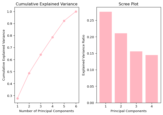
To decide the optimal number of components, we can use both a cumulative explained variance plot and a scree plot to visualize explained variance ratio.
Code
# Cumulative Explained Variance Plotcumulative_explained_variance = np.cumsum(sorted_eigenvalue) /sum(sorted_eigenvalue)plt.subplot(1, 2, 1) # 1 row, 2 columns, first plotplt.plot(range(1, len(cumulative_explained_variance) +1), cumulative_explained_variance, marker='o', color='#FFB6C1')plt.title('Cumulative Explained Variance')plt.xlabel('Number of Principal Components')plt.ylabel('Cumulative Explained Variance')# Scree Plotplt.subplot(1, 2, 2) # 1 row, 2 columns, second plotexplained_variance_ratio = pca.explained_variance_ratio_print("Explained Variance Ratio for Each Component:")print(explained_variance_ratio)plt.bar(range(1, len(explained_variance_ratio) +1), explained_variance_ratio, color='#FFB6C1')plt.title('Scree Plot')plt.xlabel('Principal Components')plt.ylabel('Explained Variance Ratio')plt.tight_layout() # Adjust layout for better spacingplt.show()# find the number of variables it takes to reach a variance of 0.75desired_variance =0.75num_components = np.argmax(cumulative_explained_variance >= desired_variance) +1print(f"Number of components to capture {desired_variance *100}% variance: {num_components}")
Explained Variance Ratio for Each Component:
[0.27601497 0.21025838 0.1555703  0.14444459]
Number of components to capture 75.0% variance: 4
As a general guideline, the goal is to retain at least 80% of the variance. However, given the relatively small size of our dataset, we have adjusted the threshold to 75%. Therefore, we will select 4 components, ensuring the cumulative explained variance surpasses 75%.
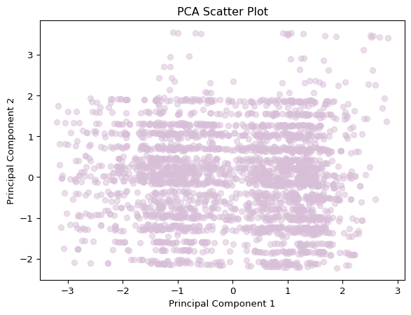
Visualizing reduced-dimensional data
Now, let’s visualize the reduced-dimensional data using a scatter plot of the first two principal components.
Code
# pca scatter plotplt.scatter(nova_pca[:, 0], nova_pca[:, 1], alpha=0.5, color='#D8BFD8')plt.title('PCA Scatter Plot')plt.xlabel('Principal Component 1')plt.ylabel('Principal Component 2')plt.show()# limit PCA to 4 componentspca = PCA(n_components=4)# save nova_pca to csvnova_pca_df = pd.DataFrame(nova_pca)nova_pca_df.to_csv('./data/modified_data/nova_pca.csv', index=False)
The scree plot guides us in determining that capturing 75% of the variance necessitates employing four principal components. The scatter plot, showcasing the reduced-dimensional data, visually represents patterns within the dataset. You many notice that a seperation occurs where Principal Component 1 equals 0. While PCA excels at identifying linear relationships, it’s important to acknowledge that observations with higher variability may be distant from the main cluster. These steps underscore how PCA simplifies dimensionality reduction, fostering a deeper understanding of the dataset. It’s worth noting that the sklearn library’s PCA function automates these procedures for ease of implementation.
Dimensionality Reduction with t-SNE
t-SNE, or t-distributed Stochastic Neighbor Embedding, is an unsupervised non-linear dimensionality reduction technique designed to explore and visualize high-dimensional data. It transforms complex datasets into a lower-dimensional space, emphasizing preserving local relationships among data points. By finding similarity measures between pairs of instances in higher and lower dimensional spaces and optimizing these measures, t-SNE enhances our ability to interpret intricate datasets.
Additionally, exploring clustering in this context allows me to identify distinct groups or patterns within the NCAA shot data. By combining t-SNE, a dimensionality reduction technique, with KMeans clustering, I can uncover and visualize natural structures or associations in the dataset. The choice of three clusters is informed by the results obtained on the clustering page. Exploring different perplexity values enhances the flexibility of my analysis, helping me discover nuanced patterns at varying levels of detail.
Code
from sklearn.manifold import TSNEfrom sklearn.cluster import KMeansimport plotly.express as pximport pandas as pddef explore_tsne(perplexity_value): X = nova_features.iloc[:, :]# t-SNE for 3 dimensions with different perplexity tsne = TSNE(n_components=3, random_state=1, perplexity=perplexity_value) X_tsne = tsne.fit_transform(X)# KMeans clustering kmeans = KMeans(n_clusters=3, random_state=42) clusters = kmeans.fit_predict(X)# Create a DataFrame with 3D data tsne_df = pd.DataFrame(data=X_tsne, columns=['Dimension 1', 'Dimension 2', 'Dimension 3']) tsne_df['Cluster'] = clusters# Interactive 3D scatter plot with plotly fig = px.scatter_3d(tsne_df, x='Dimension 1', y='Dimension 2', z='Dimension 3', color='Cluster', symbol='Cluster', opacity=0.7, size_max=10, title=f't-SNE 3D Visualization (Perplexity={perplexity_value})', labels={'Cluster': 'Cluster'})# Show the plot fig.show()# Explore t-SNE with different perplexity valuesperplexities = [5, 20, 40] # Add more values as neededfor perplexity_value in perplexities: explore_tsne(perplexity_value)
Perplexity in t-SNE determines the balance between capturing local and global relationships in the data’s low-dimensional representation. Lower perplexity values focus on local details, higher values emphasize global structures, while moderate values strike a balance. Experimenting with different perplexity values helps find an optimal configuration for visualizing and understanding the dataset. As I explored various perplexity values, I noticed that with larger perplexity values, clusters became more distinct, revealing clearer patterns and structures within the data. This observation underscores the importance of choosing an appropriate perplexity value for the specific characteristics of the dataset, ultimately enhancing the effectiveness of t-SNE in revealing underlying structures.
Evaluation & Comparison
In summary, PCA efficiently preserves the overall structure, making it well-suited for large datasets with linear relationships. Conversely, t-SNE excels at unveiling local structures and clusters, offering enhanced visualization for smaller datasets. The decision between these techniques hinges on factors like dataset size, structure, and specific analysis goals.
In my analysis, it became evident that certain variables play a crucial role in explaining most of the variance in our dataset. Despite having only six feature variables, retaining four allows us to preserve over 75% of the variance, indicating limited redundancy. The application of t-SNE for cluster visualization proved insightful, revealing subtle overlaps within the clusters. This aligns with previous observations, reinforcing that identifying distinct clusters in this dataset poses challenges.
Extra Joke
If we were compressed down to a single dimension… what would be the point of it all?